Designing a new logo for your business can be stress inducing. No one wants their company’s logo to end up on a “top logo fails” list. These lists are populated with accidental inappropriate suggestions and innuendos.
This could easily happen though if you don’t pay attention to all of the elements of your logo. We are here to help you.
By following the below guide you will have a logo worthy of ranking among the top cool logos.
Own Your Cool Logos
The first step in creating an awesome logo for your company is to make it unique to you.
Don’t go with your first idea, this is usually the most generic thing you can come up with. If you thought of it so easily, a million other people probably did too.
Don’t fall back on templates or predesigned logos. You also don’t want to use clip art in your logo. Both of these are the generic and easy way out.
Give It Meaning
Some of the best logos have a story and meaning behind them. Don’t just make a logo for the sake of making a logo. Instead think about the company’s history, moto, and purpose.
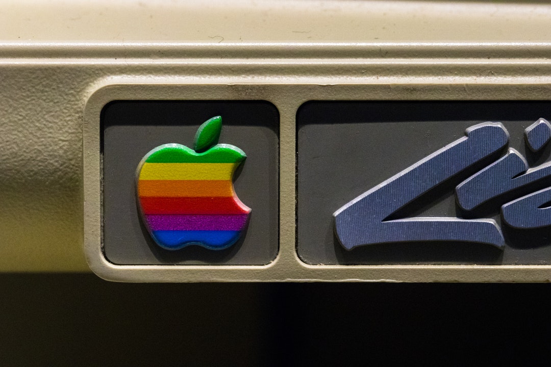
If you can tie your logo to the company intimately it will have a stronger message. That bite out of the Apple logo? It’s the missing “byte”.
That arrow in the FedEx logo? It’s the company moving forward and making your deliveries.
Skip the Boring Font
We admit, there is something to be said for simplicity. But that doesn’t mean you need to use the vastly overused Helvetica font.
To be truly cool, go with a custom drawn font. This will make it difficult for someone to rip off your design.
Choose the Right Color
Don’t make the mistake of thinking that color is a superficial decision. This is not the time to go with your favorite color. The color you pick will affect your brand’s perception.
If your company already has a color, then it’s best to go with that one. This way you create cohesiveness in your brand image.
Sometimes you have complete freedom when it comes to choosing a color. In this case, you’ll want to consider color psychology when picking your palate.
If you are new to creating a logo, remember that less is more. Try to stick with 1 to 3 colors.
Check for No Color Viability
The biggest thing that people forget is to check their logo design in greyscale and true single color versions. These versions will become useful in certain applications where you are limited with color.
Greyscale is when the colors of your logo are converted to varying shades of grey. True one color black is a simplified black and negative space version of your logo.
Make It Pleasant to Look At
The best logos are visually balanced. This means that that logo isn’t awkwardly top or one side heavy. It also means that the curves are balanced and proportional.
If you use a certain arch size or a certain angle size, stick with it throughout the logo. This will help the logo to be visually appealing to people.
Your customers won’t specifically know if you get this wrong. But they will notice that your logo is unpleasant and bothers them for some unknown reason.
Don’t be Cliche
Just like websites, logos have trends that come and go. You’ll want to consider jumping on the latest logo trend bandwagon carefully.
When you follow a trend, you risk your logo looking dated in a few years. This means you’ll be in this same place again working on designing a new logo for your company.
The other problem with following a trend is that your logo will look similar to many other logos out there. Your business won’t stand out or be memorable.
Don’t Get Too Complicated
Your logo doesn’t always need a font. Instead, you can opt for a single iconic image. Think the Apple or Nike logo. Both of these logos are simplistic in design but instantly recognizable.
If you are going to go this route, do your research before you settle on an icon. The worst thing you can do is copy another well-known company.
Aim to create a logo that has some sort of unique feature. Take the Apple logo for example. It isn’t just an apple. It’s that bite that’s taken out of it that makes it unique.
Use the Negative Space
One way to make your logo stand out is to utilize the negative space. Take a look at the USA Network logo. The S isn’t actually there.
You can also see negative space cleverly used in the FedEx logo. Have you ever noticed the arrow between the E and X?
It’s a subtle message to their customers that they get packages moving.
Get Moving
We aren’t suggesting that you make your logo actually move. Instead, you can use art techniques to inspire the idea of movement.
The Twitter logo is a great example of this. That little blue bird is pointed upward as if taking off in flight. Its wings are back, as if in mid-flight.
Carefully consider before using this art technique for your logo. It works well for mascot logos and some inanimate objects. But is inspiring movement something that works well with your company and branding?
Create Your Logo
Cool logos aren’t overly complicated and detailed. You just need to be true to your company’s personality and values.
Think about the different elements of your logo and don’t get tied up in the latest fads. It’s best to brainstorm and come up with many different ideas and let your logo evolve.
You know you have the right logo design when it is unique and instantly recognizable.
Struggling to get started branding and marketing your company? Contact us today and let us help you.


